

In this data-analysis-driven world, if you wish to expand your profile and attract new clients for your professional endeavour, you must comprehend what the existing customers are missing out on and what the potential customers are looking at. The Quick Analysis Tool Excel allows you to analyse data and understand complex spreadsheets. This, therefore, gives you an insight into the data you want and thereby assists you in making certain decisions regarding expanding your customer base.
This discussion will focus on where to find this Quick Analysis Tool in Excel, how to use it with some practical examples, what to do to fix it, and the benefits of using it. Let’s learn how to be productive and use this to save some time –
Table of Contents
Where to find the Quick Analysis Tool Excel?
The Quick Analysis Tool Excel is one of the most dynamic features providing you with a range of options to analyse data. When analysing the data, rather than going through a horde of tabs, you can always use this analysis tool to insert visualizations, charts, formats, formulas, sparklines and PivotTables. Making it easy to analyse the trends and visualise the relationship between data points, the sheet can be created in a matter of minutes.
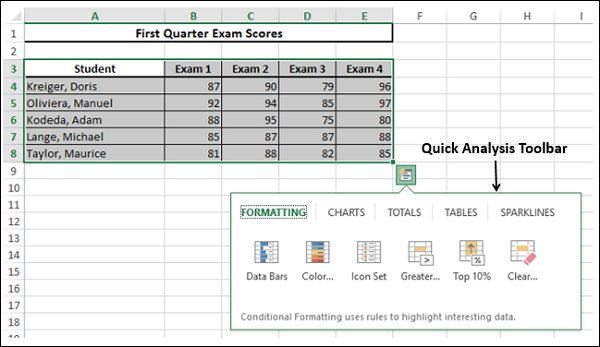
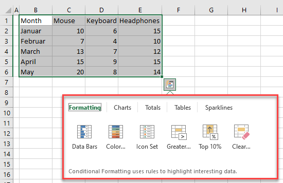
You will make a mistake if you try searching for this tool in the Excel ribbon. To access it, you will have to select a range of data (that is, the cell data range in Excel). Once you do that, you will see an icon to the bottom right of that selection, and you will have to click on the same. On doing the needful, this tool belt of options will assist you in interacting with your data in the right way.
In case you wish to use a shortcut button, you will have to select a range of data and then click on the ‘Ctrl+Q’ button to access this tool.
Now that you can go and find the Quick Analysis Tool Excel – let’s see in what scenarios and how you may use this tool to benefit data ranging and analysis.
How to use it to analyse data?
Assuming you have located this Quick Analysis Tool Excel it is time to understand how to use it for your benefit –
For the unversed, there are 5 ways of using this for maximum results: conditional formatting, charts, calculations, inserting tables and sparklines.
Here’s the way –
Usage 1 – How to calculate the column or row totals?
Specifically speaking, you will have to go to the menu of Quick Analysis and select the Totals. If you need Column Totals, you will have to use a Blue shade for that. But if you need Row Totals, you must use Amber shade for that.
Under that Totals menu, you have other alternatives such as – percentage, average, and running total under the menu.
Usage 2 – How to apply conditional formatting?
This is another way to use the Quick Analysis Tool Excel for formatting and presenting the data. This will suggest certain previews in the conditional formatting option, such as – highlighting of dates or even date range – for you to choose from.
Usage 3 – How to create PivotTables using the tool
PivotTables are crucial for understanding and analysing the data. When you open the tool, you will have to check the Tables section to find the type of pivot table. Choose the table that suits your requirements.
Usage 4 – How to create Charts using this tool?
When you want to create charts by using the Quick Analysis Tool Excel for better analysis of the data available – you will have to open the tool and go to the Charts section. The preliminary chart is given that you may use, but there is more than a single alternative in the Charts section.
For the unversed – you can use pie or doughnut charts to compare the sales record. If you wish to depict the sale revenue, you can use bar diagrams or line and column data charts. You must use waterfall and funnel charts if you want to show the progress rate and sequential stages of different data structures.
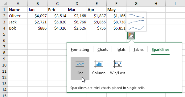
Usage 5 – How to insert Sparklines using this tool?
Sparklines are categorically used to depict trends online. When you check the Sparklines heading in this tool, you will see it just next to the data column. From there, you can edit the data range.
What are some practical usages of this?
To understand the practical usages of this Quick Analysis Tool Excel we will have to take certain hypothetical examples –
- Let’s say you have to get the sum of multiple columns or rows at one go –
In that case, you will have to select the entire dataset and click on the tool’s icon to select the required data. As you go to the Totals group, you will have to click on the ‘Sum’ tab, and that will generate a new row showing the total. You can do the same with columns.
- Let’s say you want to calculate the percentage total for a range of columns or rows –
In that case, you must select the dataset you have to count and click on the Total option. With that done, you have to click on the Total percentage option, and once that is done – you will get the required analysis.
What are the benefits of using Quick Analysis Tool Excel?
Given that by using this tool, you can not only format data and generate charts and tables but also analyse the same for better customer-driven delivery – it is crucial to have a glimpse of the benefits it offers.
When using Quick Analysis Tool Excel – you will be able to save some time, prevent typos during changing rows or cells, improve engagement by creating attractive charts and diagrams, track the progress of the company’s market growth (with the help of charts and sparklines) and finally analysing the data with the help of PivotTables.
Be assured this tool will benefit you immensely in improving your expansion process in the market.
Can you fix it?
Hoping that you have understood the usages and benefits of Quick Analysis Tool Excel, let’s now check out what to do if this tool does not work. If you are using either of the Excel versions (2013, 2016, 2019 or Excel with MS 365) and do not see the tool while selecting a range of cells, supposedly, it has been disabled.
That’s not a problem. You have to enable it. How to do it?
In the ribbon, you must click the File tab and then go to the Options section. In the Dialogue Box of the Excel Options, you must select the General tab. As it drops to show – Show Quick Analysis Options on Selection, you must click on the OK tab. Your tool is enabled.
Note this –
Before you go practising using this Quick Analysis Tool Excel for better results, know that –
- You cannot add new options to this tool’s functionality. So the concept of custom options does not work in this case. As an alternative, you can consider using the Quick Access Toolbar, which offers customisation benefits.
- If you are uncomfortable using this tool, then we would also suggest disabling it unless you are confident of the same.
Use it well
These are a handful of benefits you can obtain when using the Quick Analysis Tool Excel. From conditional formatting to inserting pivot tables and assisting the analysis process by setting up the charts in place – this tool, since its inception in 2013 and its latest update in 2019, is surely one of the best tools to check out. Let us know your experience using this tool, and follow this page for more updates.